America’s GDP Split
20 February 2014
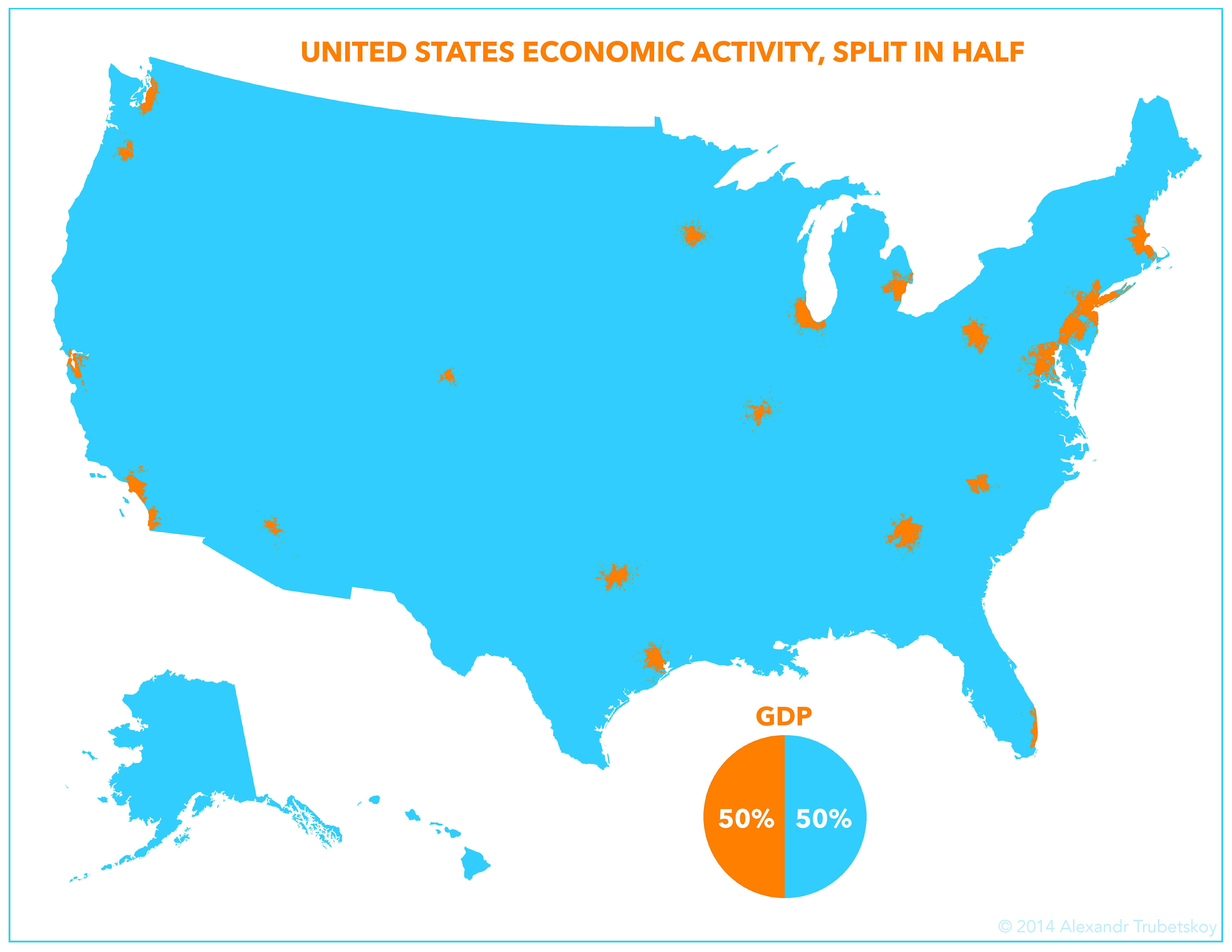
 America’s gross domestic product split geographically, 50-50.
The map shows a 50-50 split of the Gross Domestic Product (GDP) of the United States. The GDP of the cyan area is equal to the GDP of the orange area. This would equate to $8.10 trillion for each colored half in the above map.
The orange areas are the 23 largest metro areas (technically MSA’s) by GDP. When added together, their figure equals that of the rest of the country.
What inspired me to do this was the simplicity of the half-and-half split. Sure, you can easily divide the country’s economy north-south or east-west, but I set out to visualize the divide in a way that was more visually striking. Searching for the most lopsided possible split, I sifted through GDP data and realized that the top six metro areas account for a quarter of GDP. That got me curious on the half-and-half split, which I then proceeded to illustrate. The resulting map shows how geographically concentrated the country’s economic resources are.
My data comes from this publication by the Bureau of Economic Analysis, part of the Department of Commerce.