List of 20 Simple, Distinct Colors
11 January 2017
'#e6194b', '#3cb44b', '#ffe119', '#4363d8', '#f58231', '#911eb4', '#46f0f0', '#f032e6', '#bcf60c', '#fabebe', '#008080', '#e6beff', '#9a6324', '#fffac8', '#800000', '#aaffc3', '#808000', '#ffd8b1', '#000075', '#808080', '#ffffff', '#000000'
Test:
Note: This is just to test contrast. Don't use more than 5 colors in a real line chart.
In making my Roman Roads project, I came across a problem. The challenge was to color-code 20 different rail lines for a metro system diagram, and I found myself spending an inordinate amount of time choosing the colors. No matter what I did, some colors were too similar and could be easily confused.
(Update: I went with repeating colors instead, numbering each line and making sure that same-colored lines were far from each other.)
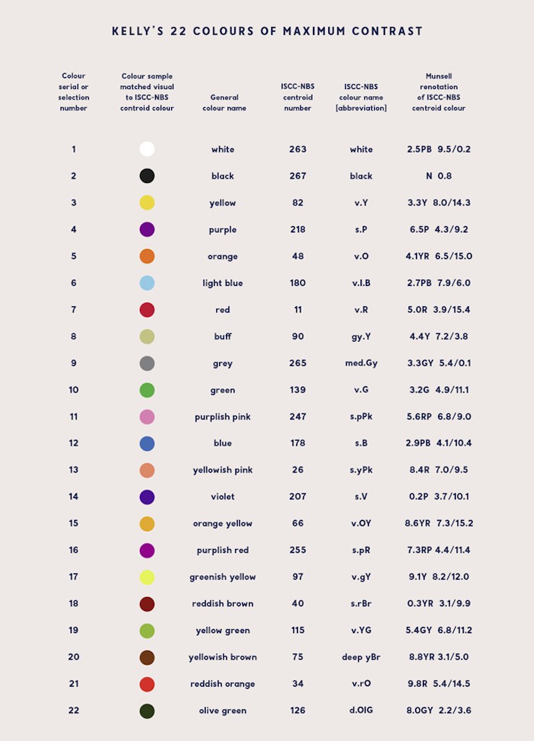
Surely I’m not the first person to have this issue, I thought. So I did some googling and came across Kelly’s 22 Colors of Maximum Contrast. Unfortunately towards the bottom of Kelly’s list things get a bit complicated. The orange yellow, purplish red, yellowish brown and reddish orange all seemed to blend together. Not only that, there were no hex triplets, nor RGB nor CMYK values.
Every list of colors that I found online suffered from the same problems. So I made my own, with colors that are:
- Easily distinguishable
- Tastefully luminant
- Given simple, intuitive names
- Supplied with hex, RGB and CMYK values
Without further ado, I present my own list of 20 simple and visually distinct colors, plus black and white.
I’ve arranged the “convenient” order so that if you want six colors, for example, just choose the first six. The order of the colors is inspired by their frequency of appearance on all the world’s subway maps (yes, I did count them all!).
Some of the color names (like blue or green) don’t match up to typical HTML or RGB conventions. I did this deliberately, to further differentiate the colors. The conversions between various color spaces are not exact, but in my experience they work well.
Update 2: Now with accessibility! With the help of Color Blindness Simulator and this page listing color blindness frequencies, I’ve added a function that allows the user to choose what percentage of the population they are seeking accessibility for:
- Approximately 95% of the general population has normal color vision and would have full access to the original palette.
- Another 4% of the population has all three types of cones (RGB), but the red or green cones may not be fully functional, making it more difficult to distinguish green/yellow and blue/purple combinations. I remove some colors that get too close to each other, such as olive, which becomes like brown.
- A further 1% of the population is missing red or green cones. Roughly speaking, they see colors with wavelengths longer than cyan (e.g. red, green) as shades of yellow, and colors with wavelengths shorter than cyan (e.g. purple) as shades of blue. Since they appear to have the same hue, the only differentiating factors become luminance and chromaticity. Orange and yellow can still be distinguished, but orange looks like a darker yellow.
- The final 0.01% of the population may have weak or missing blue cones, only one type of cone, or no cones at all. People with tritanomaly (weak blue cones) can see almost the entire spectrum just fine, while people with tritanopia (no blue cones) see, roughly, yellow through purple as cyan, and magenta through orange as red. However, this is such a rare condition that I made the final option tailored for the lowest common denominator: people who cannot distinguish any hues. Yellow becomes light grey, and blue becomes dark grey.