4 March 2018
Printable United States map
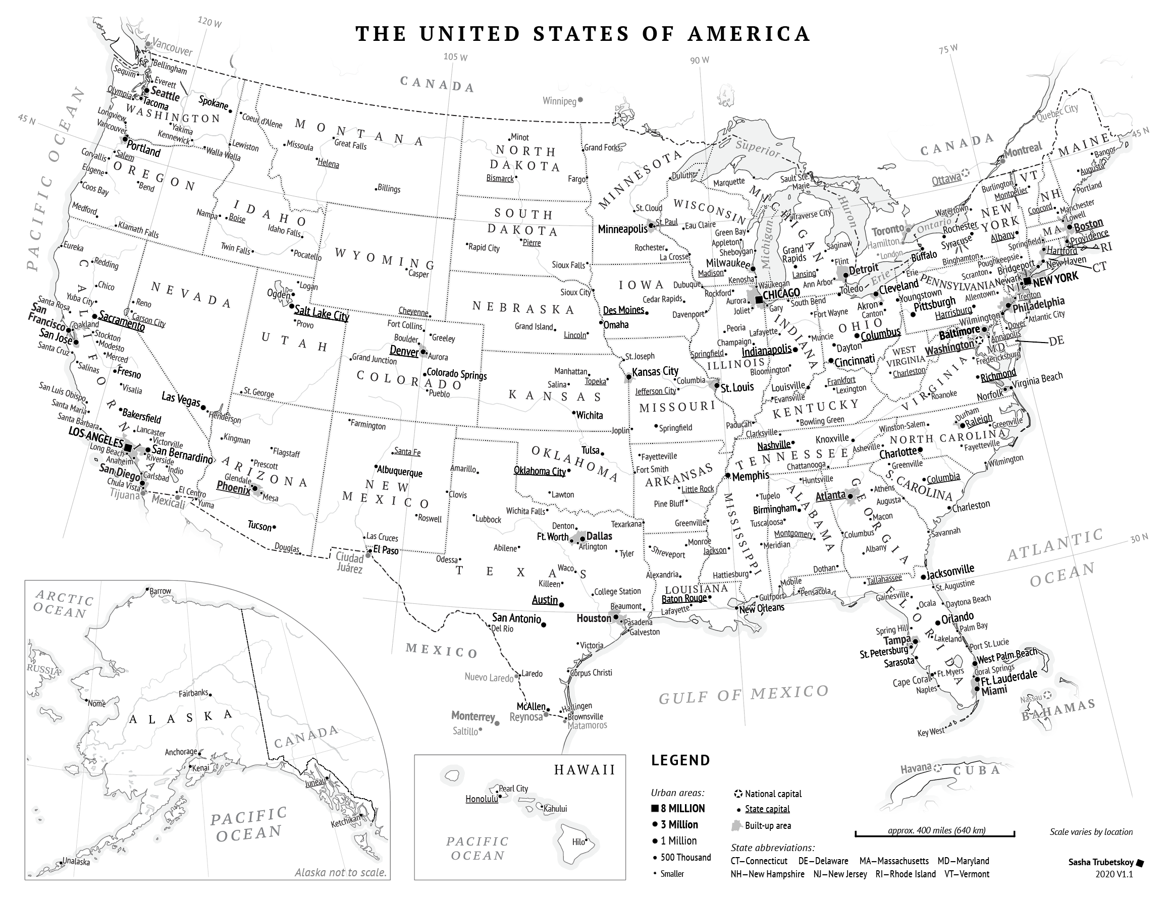


This is a general-purpose map of the United States, designed from the bottom up to be printable by everyone, and to look great on the humble 8.5 x 11 paper.
When making maps, or just looking at data, I do a lot of sketching. I usually Google Image search some kind of basemap, and scribble on that. Except all the maps were ugly, or inaccurate, or imprecise. It seemed like a simple, printable US map should have existed out there, but alas, I couldn’t find one that satisfied my needs—so I made one.
Making this map was generally pretty fun. I love tinkering with little adjustments to see which label placement or line thickness pleases my eye ever so slightly more. It was also tedious at times, such as when I had to change the sizes of all the city dots.
The most interesting constraint was that the map had to be in high-contrast black and white. This is due to my printer—being a cheap college student, I had bought the cheapest laser printer I could find, which turned out to be a Brother HL-L234. The printer is fantastic, but only prints in monochrome. I disregarded that fact, thinking that a color map could auto-convert reasonably well to black and white. To my great frustration, a few test prints showed the conversion to be quite unreliable.
There were two realizations that helped rationalize away this initial frustration. First of all, surely I’m not the only person whose day-to-day printer is monochrome. If I want this map to be a public resource, I have to design for the lowest common denominator. By making the map black and white, I would make it more accessible. And second, it’s a fun design challenge. How would I, a color junkie, handle the withdrawal?
At first I relied on about 4-5 shades along the grey scale (white, black, and a couple of greys). I took great care to make sure they were all visually distinct, and to some extent I succeeded. Roads, rivers, urban form and coastline all looked crisp and easily distinguishable on the Retina screen. But as soon as I made a test print, it became clear that even 3 greys was too much for my poor monochrome Brother. The printer was made to draw black letters on white paper, nothing more. My map had become a mess—in particular, the very light greys were rendered much darker than I wanted.
I went back to the drawing board. I scrapped all fills, backgrounds, etc. I wanted the land to stand out from water, so I had to settle on using a gentle “ocean strip”. To put the focus on the United States, I lightened all foreign labels and cities, rather than darkening the land as I had initially done. I got rid of the road network entirely, after realizing that for a map like this it would be completely useless. I did keep rivers and urban areas, but I may eliminate one or both of those in future versions of the map. Your feedback helps!
I made the choice to represent cities by the size of their urban area, instead of the population of the city limits. Most general-purpose maps use city proper population, including Nat Geo. But to me this doesn’t seem very reasonable. The purpose of a map like this is for the reader to get a general overview of the land. It has to be visually clear that Pittsburgh and San Antonio have importance, with 1.75 million people in each urban area. But the National Geographic approach would have you believe that “SAN ANTONIO“, population 1,327,407, is far weightier than little “Pittsburgh“, population 305,704 within the city limits. For this reason I used urban area populations from the 2010 census to weight the dots.
Things do get weird when I have multiple dots within the same urban area, like Fort Worth, Texas, for example. In that case I revert back to using the city limits population. I wish there was a better way to do this, but for now this weird hybrid solution is the best I can do to accurately represent the relative size and importance of US cities.
As you can see, in the corner it says “V1.0”. I really encourage people to provide constructive criticism so that we can make this a truly great printable resource for the Internet.